PIE Chart or PIE Diagram
Consider the table given below. This example shows the number of winners in the Olympics from different countries.
Country |
USA |
China |
Japan |
Russia |
Number of winners |
10 |
15 |
16 |
19 |
The frequency distribution, 60 (10+15+16+19) observations, are divided into 4 different components: USA, China, Japan and Russia. The value of each component represents the number of winners of the corresponding component, the sum of which is 60.
A pie chart is a method of representing data or values of different components of a frequency distribution using divisions in a circle. These divisions are known as sectors.
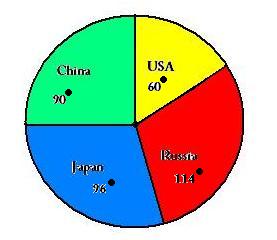
The pie chart representation of the tabulated Olympics winners is shown below:

The sectors above are constructed in such a way that the area of each sector is proportional to its corresponding value of the component in the given table.
From our lessons in geometry, we know that the area of a sector is directly proportional to the angle subtended by its arcs at the centre of the circle.
So, to construct a pie chart from the component values, we can calculate the corresponding angles at the centre.
We know that the sum of all central angles is 360◦.
Therefore, the central angle of a component = (value of the component / total value) x 360◦
Now, let us try and make a pie chart from the Olympics winners’ table ourselves.
Example : 1
Draw the pie chart for the following information:
Countries |
USA |
China |
Japan |
Russia |
Number of winners |
10 |
15 |
16 |
19 |
Solution: total winners = 60
Countries |
Number of Winners |
Central Angle |
USA |
10 |
(10/60) x 360◦ = 60◦ |
China |
15 |
(15/60) x 360◦ = 90◦ |
Japan |
16 |
(16/60) x 360◦ = 96◦ |
Russia |
19 |
(19/60) x 360◦ = 114◦ |
Remember :
whenever we are given some data, we can easily construct its corresponding pie chart. The converse is also true, i.e. the component values can be found by using a pie chart.
We know that :
Central angle of a component = (value of the component / total value) x 360◦
- Value of the component = (central angle/360◦) x total value
So, whenever we are given a pie chart, we can easily find the related data.
Example : 2
Consider the pie chart given below.
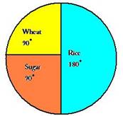
The pie chart shows the annual agricultural production. If the total production was 500 tonnes, calculate the production of
- Wheat
- Sugar
- Rice
Solution: Value of the component = (central angle/360◦) x total value
Thus, we can find each commodity.
Commodity |
Central Angle |
Production |
Wheat |
90 |
(90/360) x 500 = 125 |
Sugar |
90 |
(90/360) x 500 = 125 |
Rice |
180 |
(180/360) x 500 = 250 |
Frequencies of the components which are expressed as a percentage of total frequency are known as relative frequencies.
Thus, mathematically:
Relative frequency of a component = (frequency of a component) / (total frequency) x 100%
Example : 3
Consider the pie chart given below.
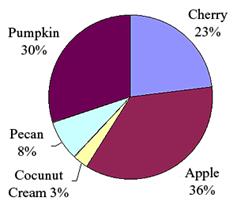
The pie chart shows the pie preferences among children. If the total production was 500 liters, calculate the production of
- Pumpkin
- Cherry
- Apple
- Coconut Cream
- Pecan
Solution:
Relative frequency of a component = (frequency of a component) / (total frequency) x 100%
Thus, we can find each commodity.
Commodity |
Liking (in percentage) |
Production |
Pumpkin |
30 |
(30/100) x 500 = 150 |
Cherry |
23 |
(23/100) x 500 = 115 |
Apple |
36 |
(36/100) x 500 = 180 |
Coconut Cream |
3 |
(3/100) x 500 = 15 |
Pecan |
8 |
(8/100) x 500 = 40 |
Try these questions:
- 240 students were surveyed as to their favorite color from a list. The results are shown in the table below
Color |
Number |
Blue |
120 |
Black |
12 |
Green |
28 |
Red |
60 |
Yellow |
20 |
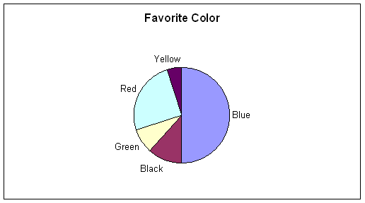
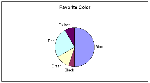
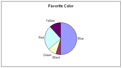
Answer: B
The portion of the circle taken up by each color is
Blue 120/240 = 50%
Black 12/240 = 5%
Green 28/240 = 11.67%
Red 60/240 = 25%
Yellow 20/240 = 8.33%
The corresponding angles are:
Blue 50% x 360 = 180°
Black 5% x 360 = 18°
Green 11.67% x 360 = 42°
Red 25% x 360 = 90°
Yellow 8.33% x 360 = 30°
- Twenty people out of 100 prefer pizza as their favorite take away food. If a pie graph was drawn to reflect this, what angle would the sector for pizza take up?
- 20°
- 100°
- 72°
- 5°
Answer : C
One fifth of the population prefer pizza, so this is shown on a pie graph as one fifth of 360° = 72°