Bar Chart
A bar chart, also called a bar graph, is a chart in which each rectangular column has a length proportional to the value of the item it represents as measured along the horizontal axis.
The bar chart is used to plot a discrete data; that is data that can only take certain values. In the previous lesson, the table (below) showed a certain number of students that like basketball, badminton and other sports. Take note that there cannot be one and a half students that like basketball i.e. there could be none, 1, 2 or any whole number; in this case there are twelve.
Game |
No. of Students |
Chess |
8 |
Badminton |
20 |
Cricket |
18 |
Table Tennis |
6 |
Football |
11 |
Basket Ball |
12 |
Total |
75 |
The height of each bar is a quick visual guide referring to the relative values of each category. For example, graphing the table above results in the following bar chart:
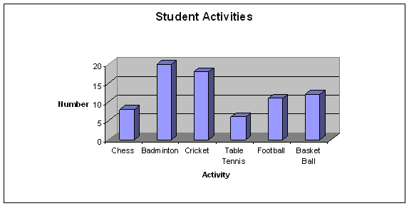
Without referring to the actual quantities it can be seen that badminton is the most popular sport, followed by cricket, with table tennis being played by the least number of students. The actual values, if needed can be read in the vertical column
Since the column categories are distinct, they are separated by equal intervals whereas a histogram consists of rectangles touching each other.
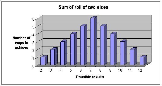
Consider also rolling two dices and adding their sum. There are only certain values that can be rolled, some of which can occur in more than one way. For example, the number 4 could be achieved by a roll of 1 on the first dice and 3 on the second, or a roll of 2 on each dice, or a roll of 3 on the first dice and 1 on the second.
The frequency table for all possibilities can then be constructed as:
Number |
Number of different ways to roll number |
2 |
1 |
3 |
2 |
4 |
3 |
5 |
4 |
6 |
5 |
7 |
6 |
8 |
5 |
9 |
4 |
10 |
3 |
11 |
2 |
12 |
1 |
The bar chart of the frequency table is
Try these questions
1. The tabulated data for the following bar chart is
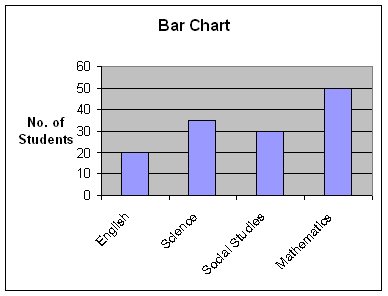
| Subject |
English |
Science |
Social Studies |
Mathematics |
Number of Students |
20 |
35 |
30 |
50 |
| Subject |
English |
Science |
Social Studies |
Mathematics |
Number of Students |
35 |
20 |
30 |
50 |
| Subject |
English |
Science |
Social Studies |
Mathematics |
Number of Students |
20 |
35 |
35 |
50 |
| Subject |
English |
Science |
Social Studies |
Mathematics |
Number of Students |
50 |
30 |
35 |
20 |
Answer : A
The quantity of each category is represented by the height of each bar.
- Three dices are rolled and their scores summed up. Which of the following methods is the best way to represent the possible outcomes and their frequency?
- Histogram
- Box plot
- Scatter plot
- Bar chart
Answer : D
A bar chart represents discrete quantities, whereas a histogram records continuous values across a range. Rolling three dices will only produce discrete values.
2. True or false? A bar chart and a histogram can show the same data set.
Answer: True.
They can, however, one or the other is often more suitable.